Rooted in rock.
When approached to design the branding of a new chain of climbing gyms in the Okanagan region of British Columbia, the founder (a geologist by profession) wanted something unique and ownable in a name and visuals. After some workshopping, it was discovered that gneiss rock (pronounced ‘nice’) is a beautiful and abundant rock found in the area. Like the foliated metamorphic rock, that has a distinct dark and light wavy banding, a pattern and special paint technique was developed. A bold, bespoke typeface was also created for the wordmark that would work well on building signage, clothing, and even the climbing walls themselves.
Gneiss Climbing
Expertise
Brand Guidelines
Brand Strategy
Campaigns
Environmental Design
Naming
Packaging
Marketing Materials
Visual Identity
Website Design

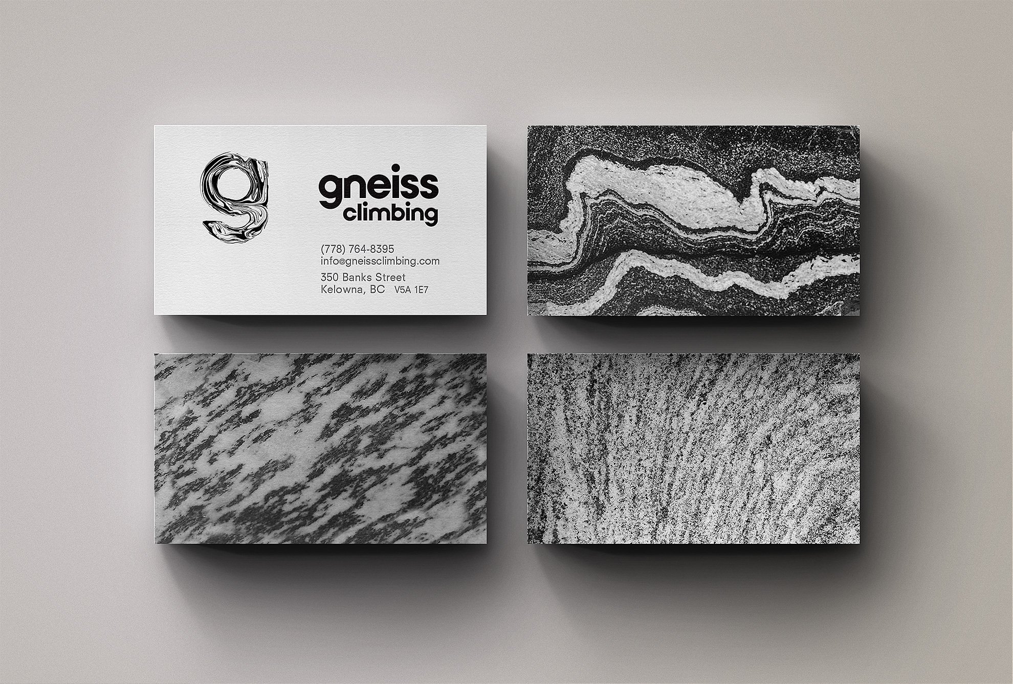
Business Cards

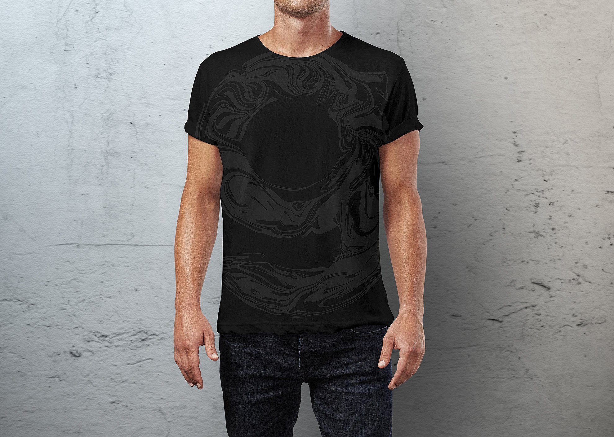

A special technique of swirling paint was used to create the 'g' icon.

Clothing line collaboration with Tyler Keeton Robbins.
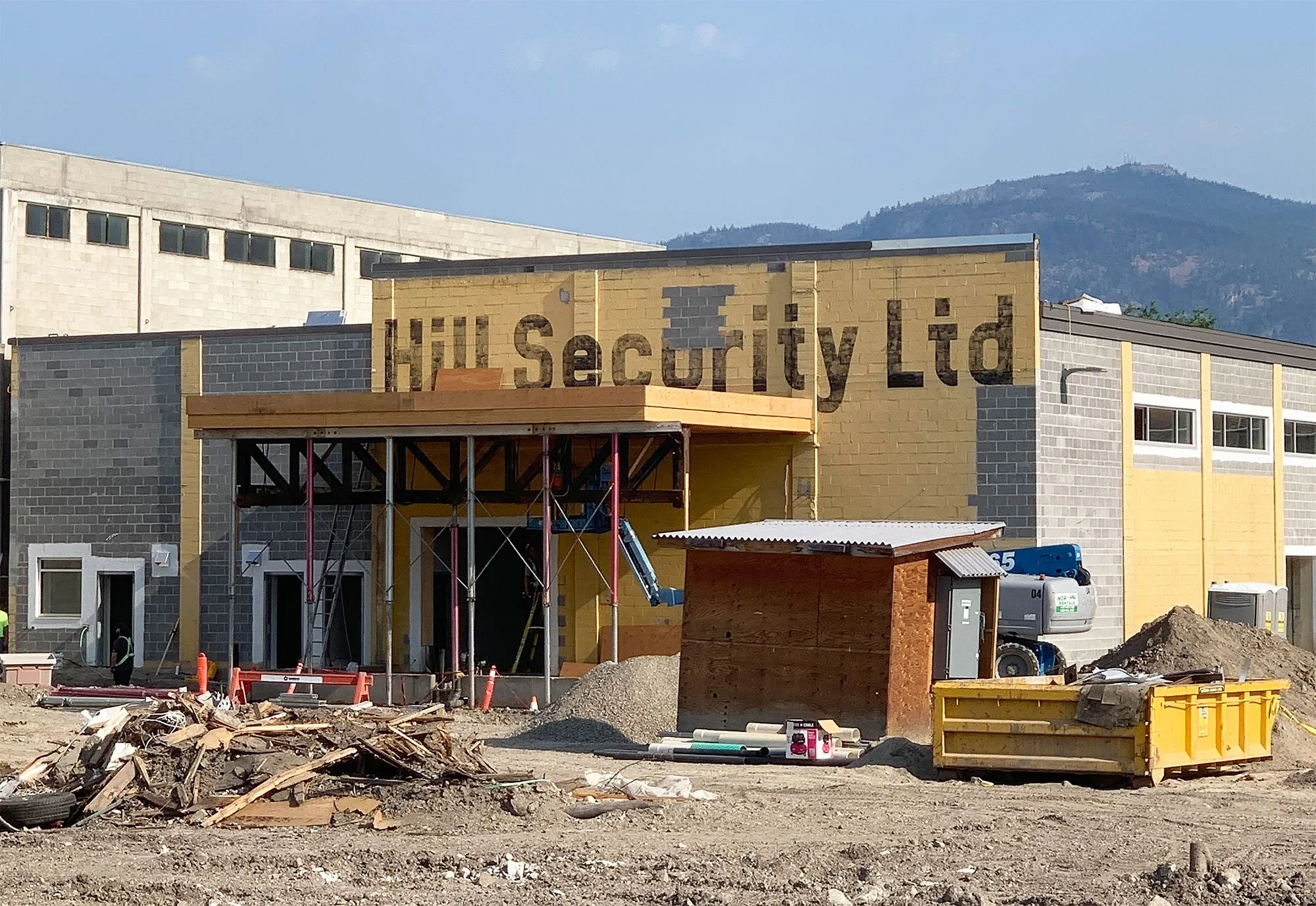
Hill Security
In July of 2021 construction of Gneiss’ second location began in the former Hill Security Building in the north end of Kelowna. Wanting to preserve and build on the heritage of the building, a bespoke wordmark was developed to pay homage to the past life of the location along with a pair of playfully watchful eyes created in the style of Gneiss’ swirling black and white symbol.
