(Almost) Every Cycling Kit I’ve Designed
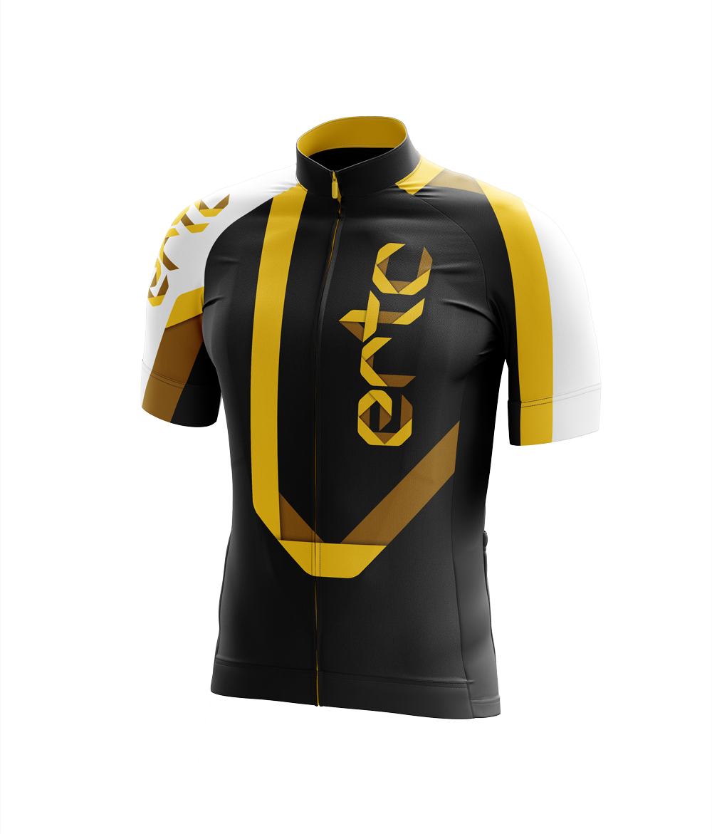
As a lifelong cyclist — primarily as a competitive road racer — it was designing cycling kit for the Edmonton Road and Track Club (ERTC) that led me into a career as a designer. I had no idea what I was doing, but I thought I had a good sense of style, so I designed a wordmark for ERTC in MS Paint.
The kit supplier — Vancouver-based Sugoi — would only accept vector-based artwork. So off I went to the University of Alberta Bookstore to buy a copy of Adobe Illustrator 8.0 on CD. From there, I churned out a pretty tepid kit (in hindsight), but I liked it at the time, and so did my teammates. Huge Canadian flag on the chest? Massive logos everywhere? Check and check. I'll endeavour to post the design here once I liberate the working files from the CD they currently reside on.
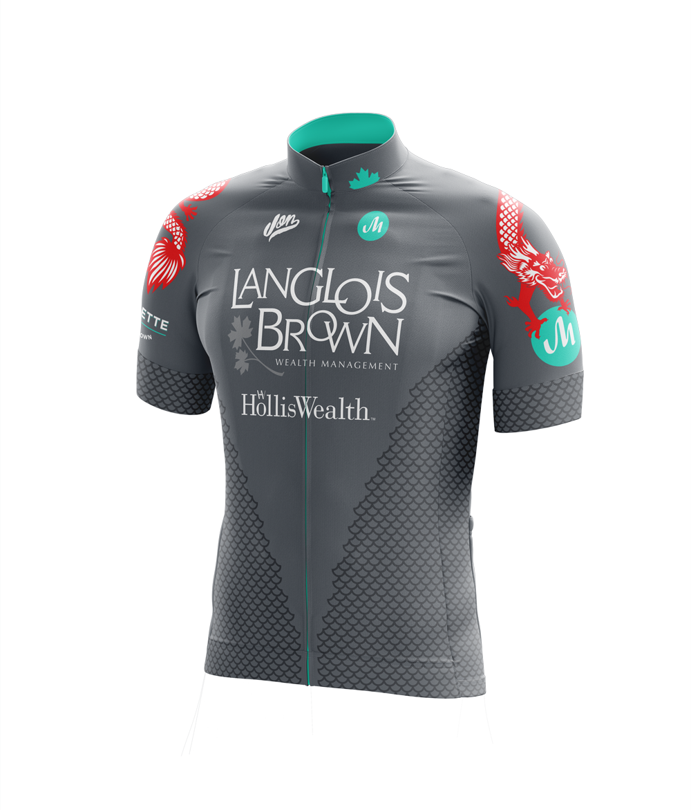
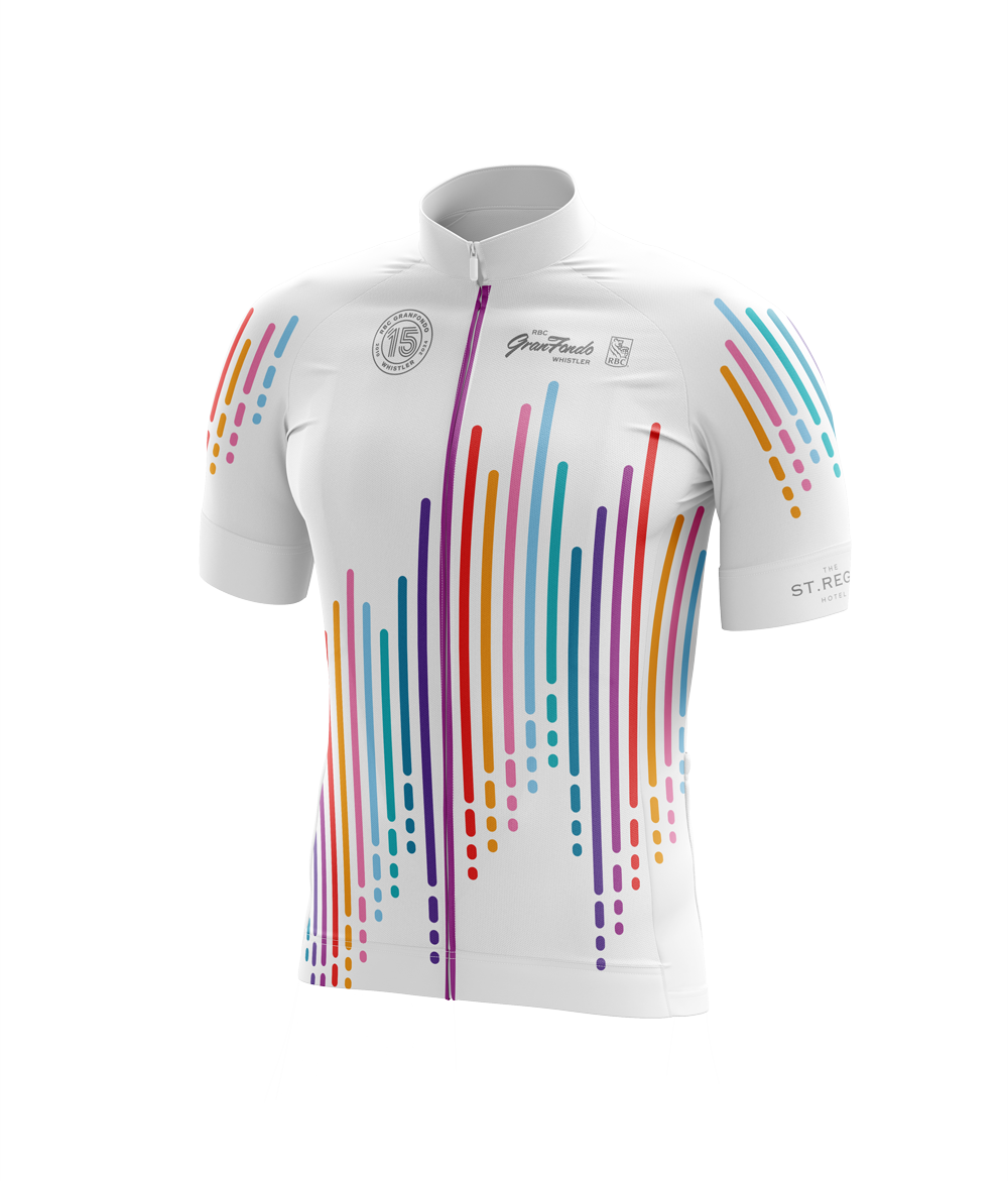
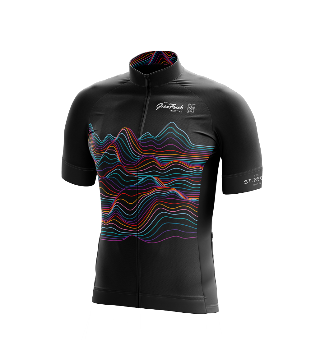
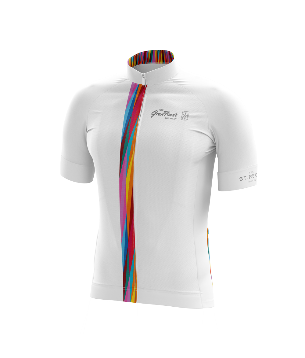
I still love designing cycling kit — a sub-speciality within the visual branding work I'm focused on — though it's a deceptively tough design brief. It's hard to predict what a client or end user will like. The ask is to design something visually interesting that looks good on all body types, is flattering, distinctive, and unique — dressing everyone the same, while every one of those people has different ideas about what looks good on them.
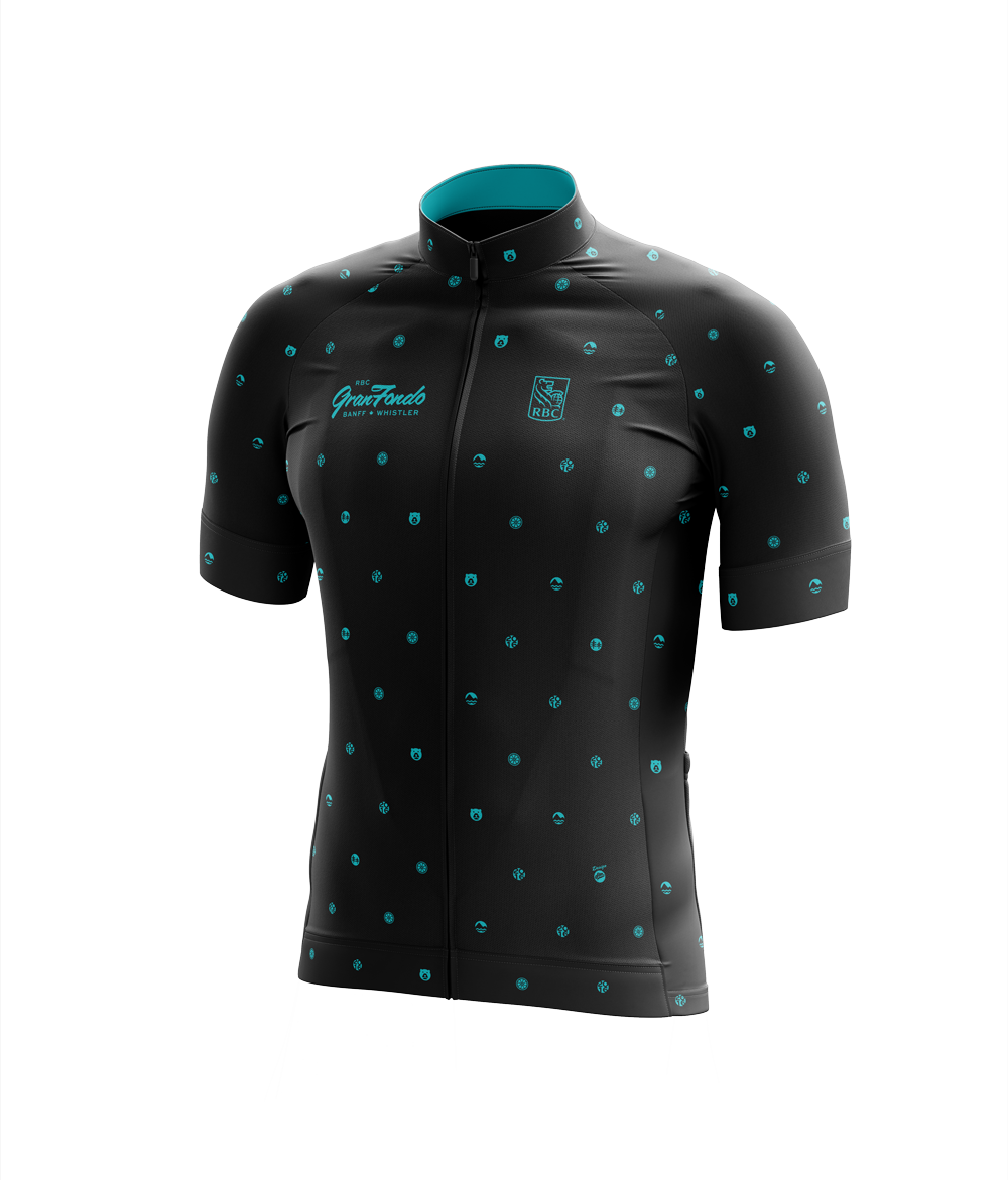
These days I like to pick and choose who I design kit for. My racing club, unique rides, good causes or even my country’s champion’s jersey (excited to share more on this in the coming months) are usually enough to motivate me to create something unique and memorable.