

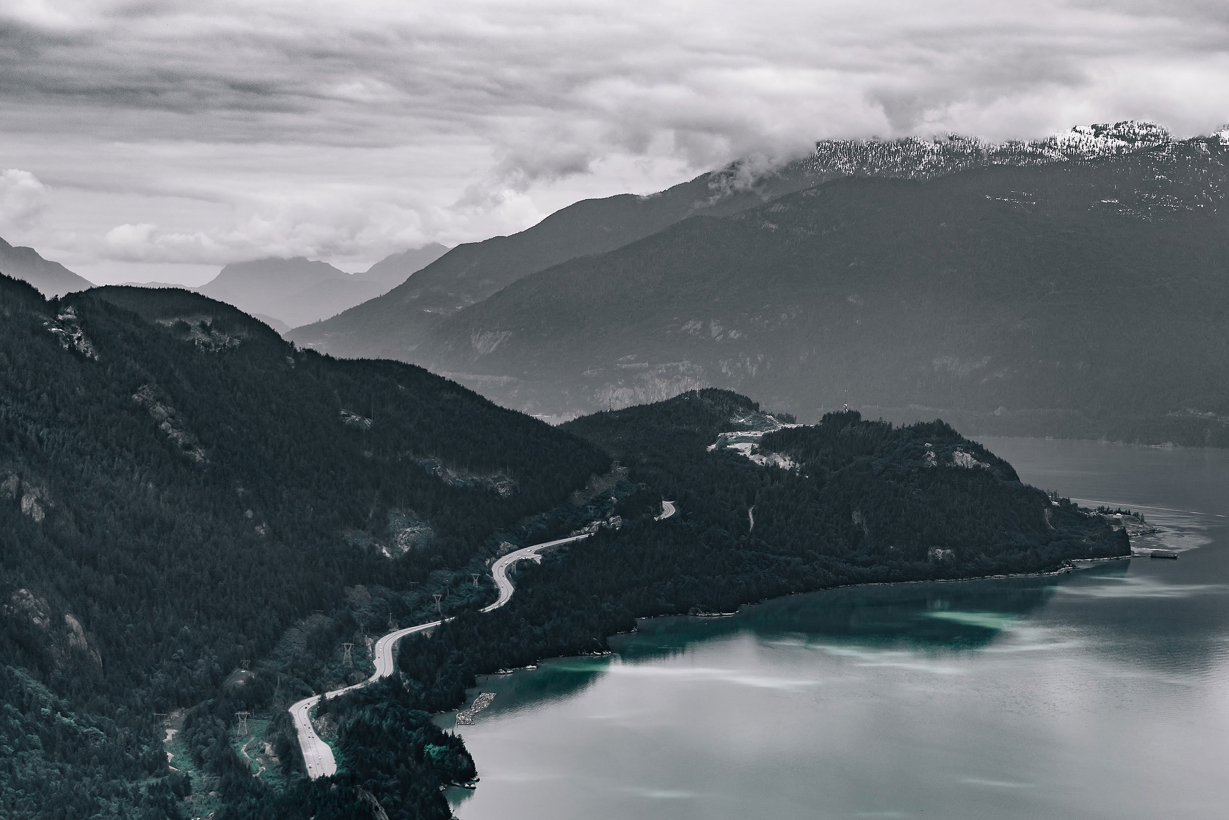
Big Ride with Big Views
North America’s largest Gran Fondo – Italian for ‘big ride’ – approached JWD for a identity refresh and merchandise program redesign in 2016. The route, which follows the Sea-to-sky highway from Vancouver to Whistler, is one of Canada’s most scenic, featuring breathtaking ocean and mountain views. The goal was to design a wordmark that spoke to the fun and approachability of the event, but one that also felt like it belonged to the sport of cycling in a historical way.
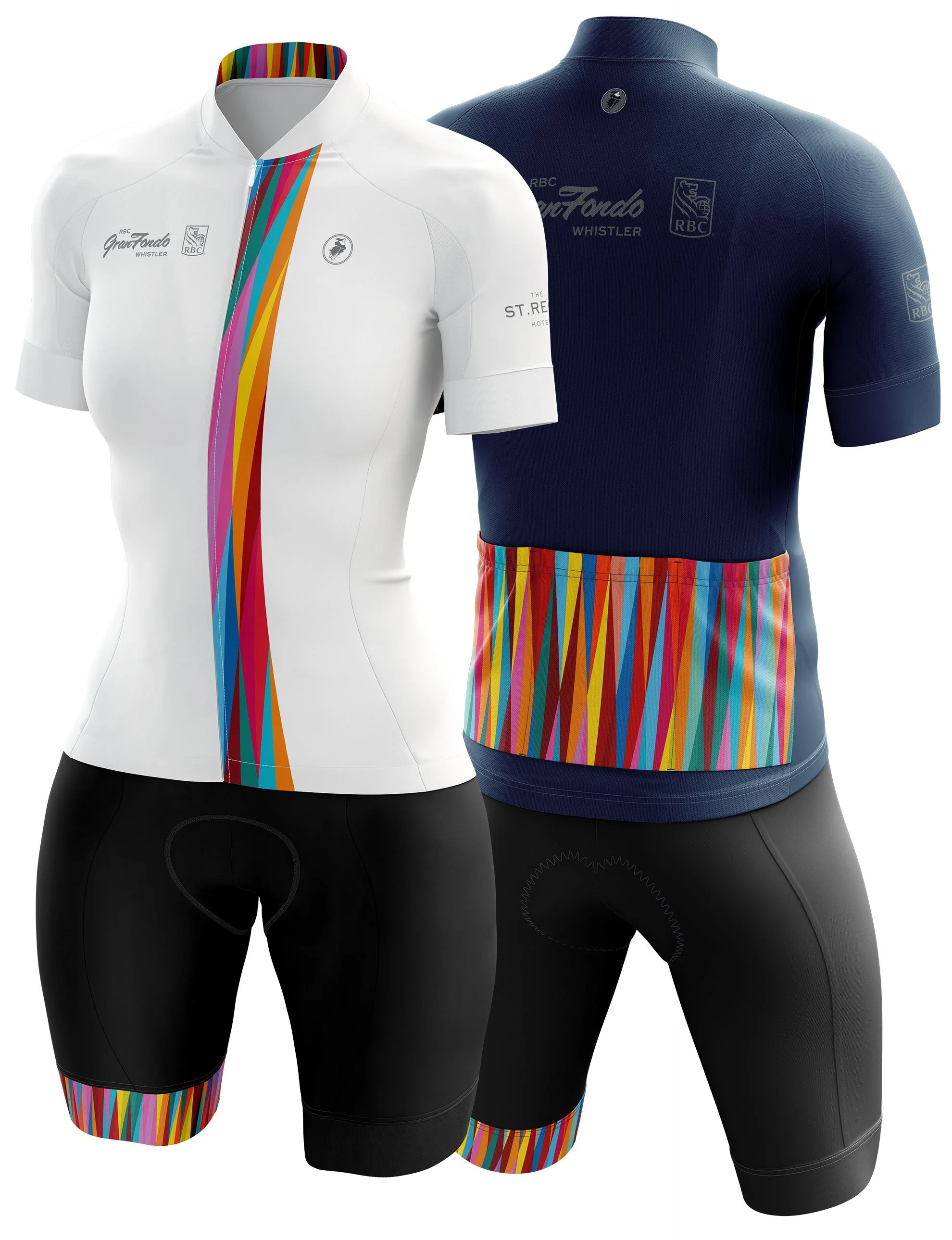
Rather than rely on an icon or a mark for the graphic identity, JWD proposed that from year to year we change the motif that would be featured on sale merchandise such as cycling kit, water bottles, caps and medals, among other things. The result was an increase in merchandise sales from previous years.
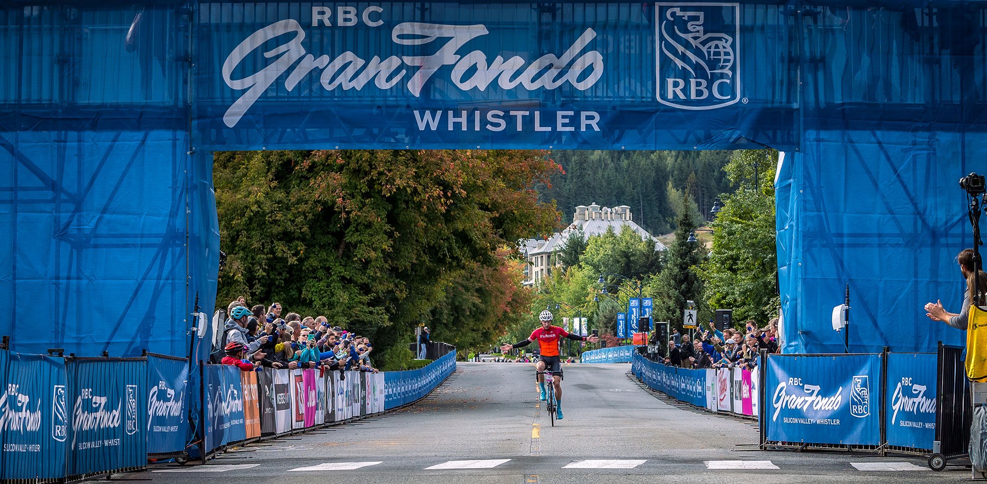
GranFondo Whistler
Expertise
Brand Guidelines
Brand Strategy
Product Design
Marketing Materials
Visual Identity
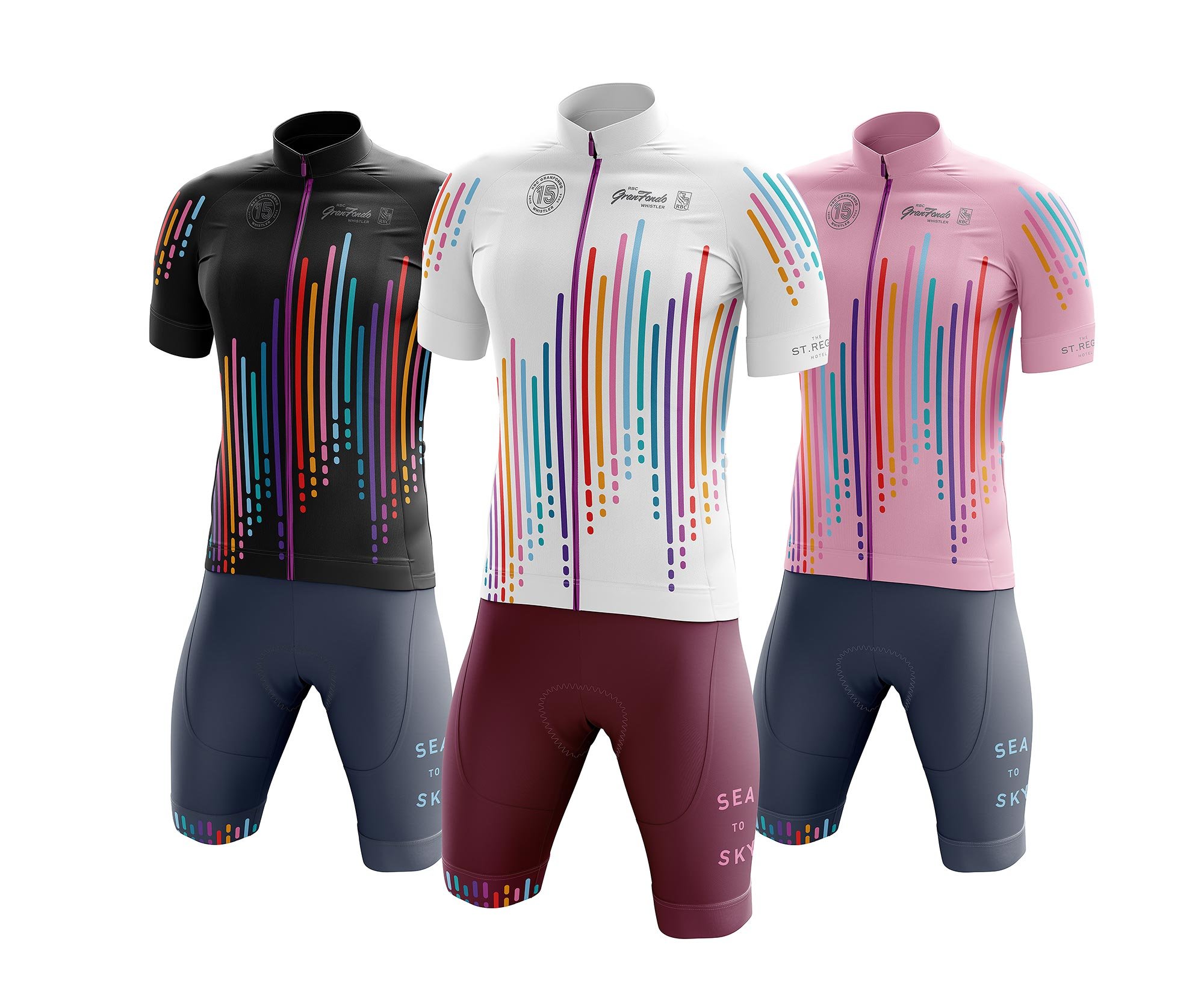
2024 GranFondo Cycling Kit
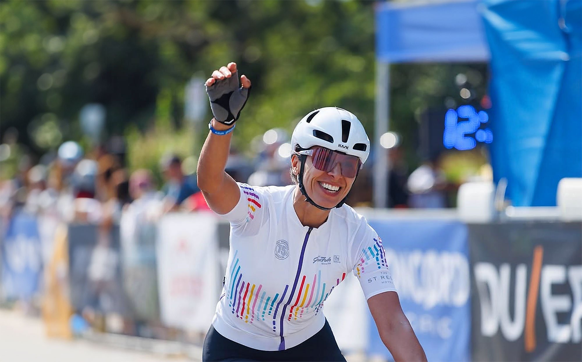
2024 GranFondo Cycling Kit. Photo: Matthew Carew
2017 Kit design
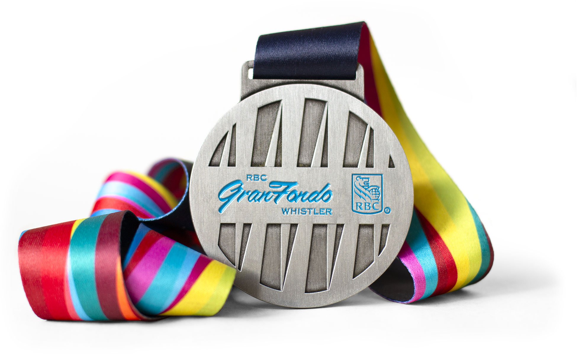
2017 Medal design
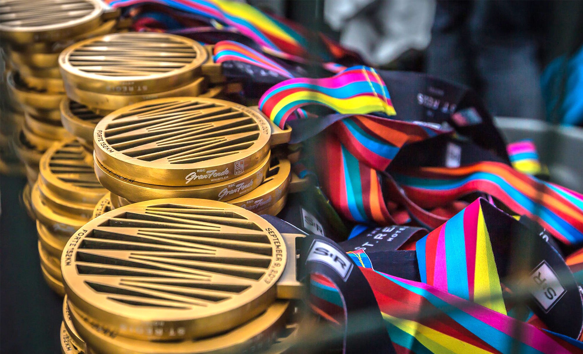
2017 Forte medal design
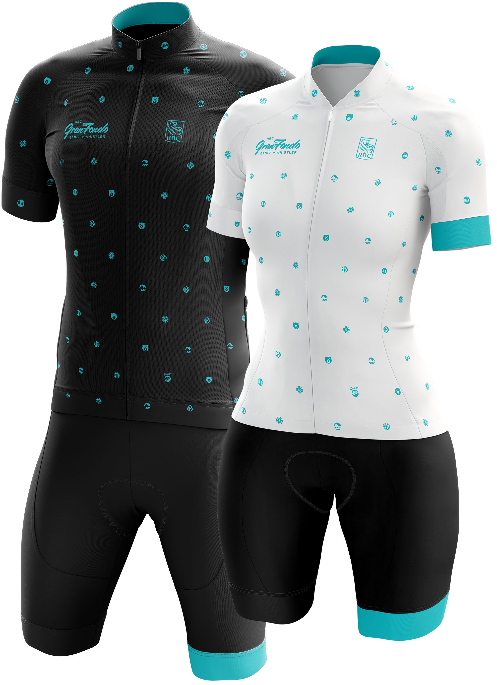
2016 Kit Design
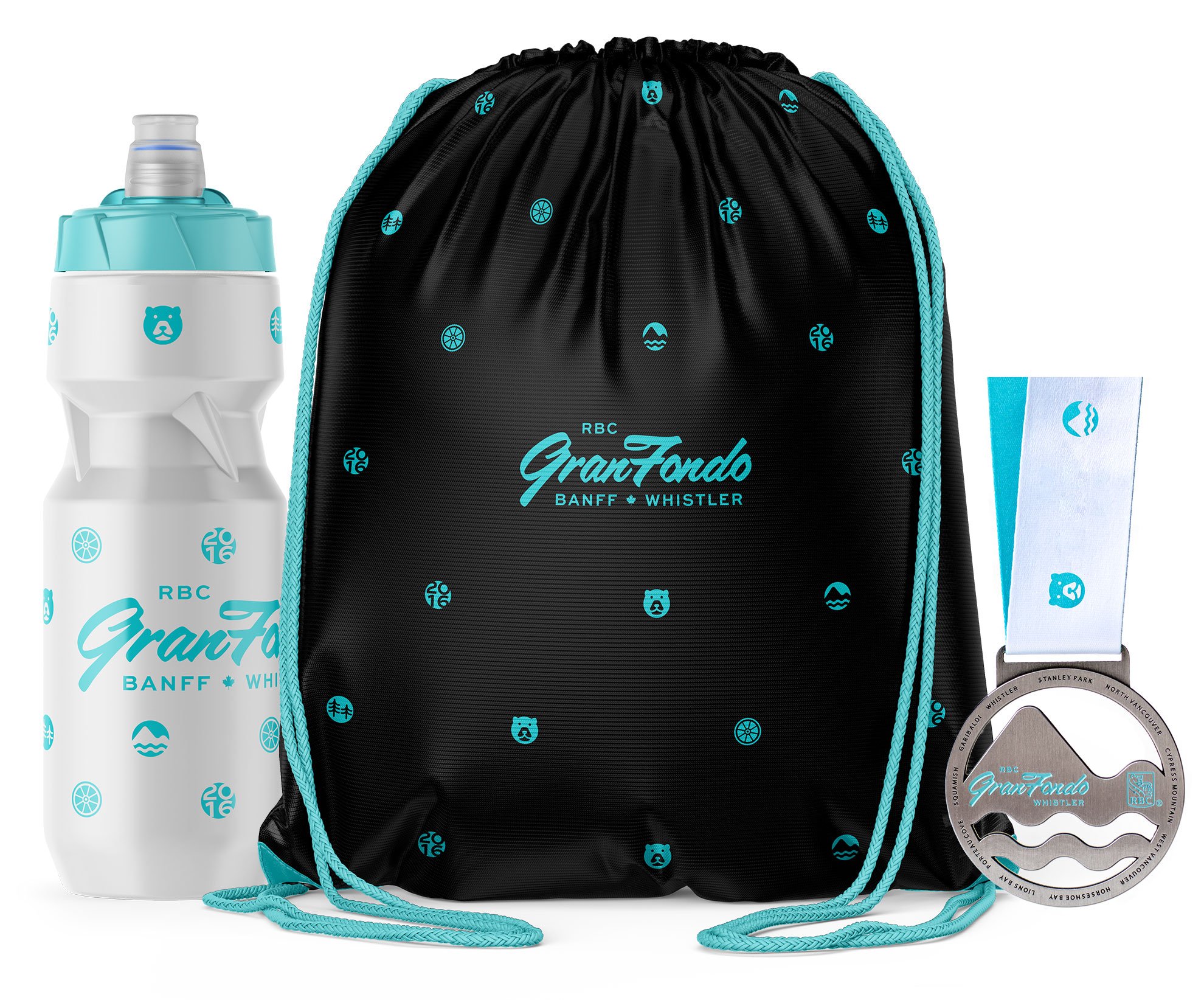
2016 Bottle, bag and medal design